Saturday, November 24, 2012

Developing and printing the 'donkey girl' images


I bought a large sheet of copper and got it cut into 15cm/21cm pieces. I wanted eight images and drew and painted about 40 different images and versions of the images from which I eventually chose the eight that I have selected so far.

After settling on the images I then had to work on drawing them to make them fit meaningfully into the size and format that I had chosen for these prints.

I bought bitumen and ferric chloride crystals so that I could prepare and etch the copper plates at home. I read about Paula Rego's prints and found that she paints on the bitumen paint with white gouache before etching. This sounded like a good idea and I found it a very good way of setting the image onto the copper plates before I started with the scratching tool. The black plates with the white drawings on them looked quite good!

Above you can see the plates with the white gouache on them, and one of the plates which has subsequently been drawn into the with tool that draws into the bitumen.

the drawing tool and the white ground on the bitumen paint

Once the eight plates were ready to be etched I had to research how to turn the ferric chloride crystals into the correct strength solution. I found a good, detailed article here and used that. If you do this at home yourself it is well worth doing some thorough research because there are some big safety issues with making an acidic solution which must be observed. One really important this with ferric chloride is that you add the crystals to water, not the other way around. A chemical reaction resulting in sudden, intense heat occurs.  The solution has to be left overnight to cool before being used. It is stored in plastic which is suitable for the storage of chemicals (like that for petrol or oil). 

Once I had made the solution I diluted it 1:1 with water and did a test run on the copper plate which I'd used in the original workshop. I covered the previous image with contact plastic and used the other side of the plate. I tested the etching solution from 5 - 50 minutes at 5 minute intervals. I found that there was no appreciable difference in the amount of etch past 25 minutes of immersion in the solution. I wanted the plates to be evenly etched, so 25 minutes it was.

I etched all of the plates, cleaned off the bitumen with turps and then had the fun job of bevelling and smoothing the edges of the plates. This reduces the risk of the edges of the copper cutting the paper when you are printing and also reduces the amount of unintentional 'border' line around the image being printed.


Thursday, October 18, 2012

Paper mask

Following on from the explorations of the potential of the bandage/plaster masks, here is the mask made from rice paper, using the latex mold.


When I decided on trying to make a paper mask using the mold I particularly wanted a translucent effect. It can be seen here, with the mask pinned on a window.


Here is the drawing I did with the tablet,


and here is the painted mask::


I might do some more work on this, maybe make another mask!!

Wednesday, October 17, 2012

White mask fever!

White mask fever has been crippling me. I put off making a decision about what to do with the masks by trying out making a rice paper one.  It will be interesting to see how it comes out of the mold.


The other masks were still staring sightlessly at the ceiling.


Okay so I've made the masks, had a little dabble with paint on one of them. Time to make a commitment. My favourite colours are Prussian Blue, Permanent Alizarin and Pthalo Green. I also have a fabulous orange and combined that with Prussian Blue.

Here is what I did with them.

Alizarin::


add pthalo green,

Eek! Mouth is awful. Off with it.

Prussian Blue::


Pthalo Green::


add Cadmium Orange,


add Prussian Blue.


I think that'll do.

Mask making

My studio project this term is about personality and identity. I am interested in the idea that we create characters which we present to others - the good daughter to our parents, the competent professional in our workplace,  the cheery buddy to our friends, the caring parent to our children. But who are we really?  I have decided to develop the concept of 'masks' as a way of exploring this. Here is my journey so far.

I have incorporated many of the techniques and ideas we have explored during workshop classes in these maquettes and in the masks.

First I made a mask out of two commercially purchased paper mache masks. Then I covered it with paper mache ::

1. I then used bandage and plaster to make a half face mask:


I built up the 'nose' a bit because I wanted to make a donkey type mask, like the one on the character who features in studio print project.

I trimmed the mask when it was dry, then painted eyes onto it. Then I glued fake fur fabric.

I made ears and stapled them on, and then painted the fur.
eyes and fur!

ears, and paint
This wasn't made as a mask to wear. I wanted it to look as if someone was wearing it.

2. Then I made another mask using the same paper mache one I used for the donkey mask. This time I covered the mask in thin plastic wrap, soaked cloth in PVA glue and then draped the cloth over the mask.


I then painted this with coloured paper pulp, but unfortunately don't have a photo of that.  This portrait is an example of the work we did with Paul during our paper casting workshop. The paper painting I did on my mask looked like vomit, so I decided to paint over it.


Here is the painted mask.

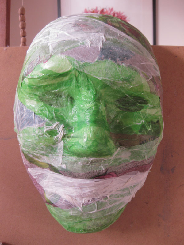
3. Next I decided to paper over the first paper mache mask with green tissue paper.


I discovered one of the great aspects of 'play' when I did this. It was not my intention to leave the mask like this, I was just experimenting with surfaces. But I really liked this effect.

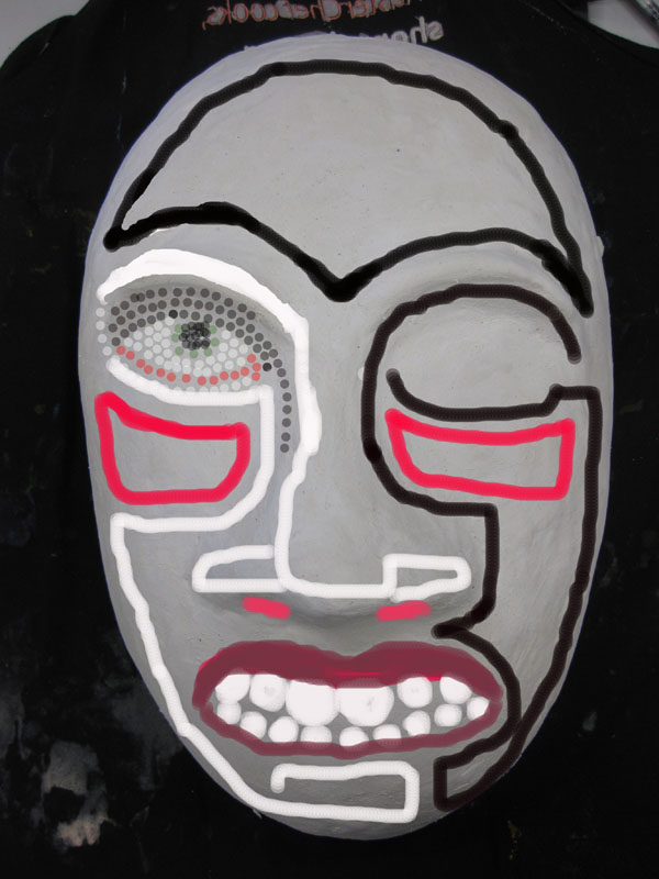
Next I used Photoshop and my Wacom tablet to experiment with painting on the green and white mask. I was not keen to work directly on it for fearing of 'ruining' it. Not a very creative strategy, but fortunately Photoshop is a very creative program and I had some fun experimenting with what I could do to the mask and in the process let go of the idea of keeping it as it was.

played with contrast and added blue shading

changed the colour and continued to play with contrast and shading
Next I decided to paper over the mask with rice paper and then I poured and painted ink over it.


4. By this stage I decided that I wanted to make 'multiple' masks so that I could explore masks as tools for adapting or adopting identity. I didn't want to continually work over one mask (although the possibilities of this, photographing the results, using photoshop to animate the process.....hmmm, very tempting) so making multiples was the way to go.

We did a workshop with Paul on making latex molds so I decided that was the process I would use.

First I had to create a model of the mask. I wanted to make it larger than life size because I didn't want my masks to look like something that could be worn. I wanted to evoke the associations of masks (adapted identity, anonymity, drama, theatre and so on) without the masks actually looking like theatrical or dance masks.

The model was to be made of clay, with a base made of scrunched up newspaper wrapped in plastic bags.

Then wrapped in plastic and taped together to make a basic form.


Then I added the clay over the top.


I wanted a strong, androgenous look. Simple but powerful, and suitable to be the 'canvas' which I would work on.

Next I had to started painting latex onto the clay. There was some thick latex at college which I used for this.

latex brushed around the edge to make a border and then over the whole clay model
Next I put a layer of cotton wool around the edge, between the mask and the border layer to make that area strong.

I bought commercial cotton wool balls, unrolled them, soaked them in latex and them 'painted' them around the angle between the mask and the board it was sitting on.

Next the whole mask is covered in two layers of stocking material (the stockings women wear), which is painted onto the surface of the mask with more latex.
At this point I needed liquid latex, which I purchased from ACT Fibreglass in Fyshwick. The 1200ml of latex cost $36. The six pairs of stocking I bought cost $10. I also needed a cheap brush because using latex pretty much wrecks the brush you use, so it is worth buying a cheap one, cleaning it carefully while doing the latex applications, and then discarding it. The brush cost $1.50.

cut up pieces of stocking, liquid latex, working around the edges first


Here is the latex mold with  two layers of stockings, then a final coat of latex.


I let the whole thing dry overnight. Then it was time to make the bedding mold.

First it must be decided how many pieces of bedding mold is needed. This depends on where undercuts are. On my mask it was easy because it is a very simple shape with almost no undercutting.
We decided to make a two part bedding mold.

First I needed to make a 'wall' of clay. This needs to be supported on the side which is NOT having the plaster applied first, so that it doesn't fall over.


Then a firm coat of modelling plaster is applied to directly to the latex, up to the 'wall' of clay.


This is allowed to dry, then the clay 'wall' is removed and a thin coat of plaster and water 'slip' is painted onto the dry plaster to ensure that the two parts will separate easily, and then the other side of the plaster mold is applied.

when the second side of the plaster mold is dry, the two parts are easily separated with a chisel or screw driver
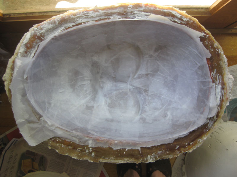
The latex mold and bedding mold.


The bedding mold needs to sit firmly inside a basket or box. Then the latex mold can sit inside it and it is ready for the masks to be made.

I made a plaster mask first, then four more using cloth and plaster. The cloth bandage and plaster masks are lighter than just plaster and are still quite strong.

I have made five so far.

I have been experimenting with ideas for how I am going to proceed with the masks.

Photoshop:


Maybe using buttons - evoking primitive masks decorated with shells and other natural objects. In my case using man made items which reflect my cultural milieu.


Still working on the large masks!

Thursday, October 4, 2012

How to produce a limited edition artist's book

Some time ago I blogged about making small artist's books after a workshop with Bernie.

Over the past few weeks I made a series of art books to show (and sell!) at an exhibition which I participated in with the Marsden Arts Group (MAG), a community arts group I have been a member of for a few years, who meet monthly to share work and learn about art and getting your art 'out there'.  We are a low key, supportive group and the exhibitions are the culmination of our year together so are celebratory in a special sense.

This year the theme for the show was 'Ten' because the group was formed ten years ago. Most of us who hung work in the show (not all members did) incorporated 'Ten' in the work somehow. I made ten (well, eleven actually, but one was for display!) little artist books, each with ten lino prints in it. The prints all referenced some aspect of my participation in the Marsden Group, except for the self portrait on the back cover which is very much about my work this year at CIT.

I wanted my work for this show to be something of a story of my experience of being a member of MAG, hence the books, and the images to read like a walk through an exhibition, so the 'reader' sees both people with art works, and art works themselves.

I prepared for and cut the lino prints in a reasonably timely manner, but hugely underestimated the time it would take to actually produce the books. There were a few stressful moments, to put it mildly, and I printed and book bound from 12.30am until 7.00am on the morning of the show!!!


 Here is a copy of the invitation to the show.


I sourced the images I used for the lino prints from photos that I had taken at previous exhibitions or of works that I had exhibited at previous exhibitions.


With the photos I used my Wacom tablet and Photoshop to draw over the photos to come up with a basic image, printed it off at the same size as the lino print (9cm x 9cm) and then transferred the image onto the lino using Saral paper.


I simplified the images a lot because there is a limit to what you can put on a small square of lino, plus I wanted to work with the black/white print image I was looking to get to make them as effective as possible, simple but expressive.


'Number 96' was a fabulous ceramic piece produced for a show we had at the Front Gallery in Lyneham, by a previous member, Jenny Snell. We also met at Jenny's house for quite a while, before eventually finding a permanent home for our meetings at M16 in Griffith. The meetings at Jenny's were wonderful, friendly times and I miss them and her, so getting this image was important to me.


I was obsessed with painting goldfish for a while and showed a set of four different pictures one year. This is one of them. I 'photoshopped' it,


 then transferred it onto the lino.


As I completed the lino cuts I printed them onto white paper to see how they looked. There were a few that didn't work for a variety of reasons. I find it quite difficult to imagine the black/white reversal thing necessary when cutting lino so that was one problem, but some images needed to be rethought and altered because I felt they didn't work in the ways I wanted, as printed images.

These two prints illustrate the sorts of choices I made about the images I used for the books. The line drawing below is the first image. I changed the background and used a more block black/white style in the image that I eventually used for the book.


first lino print, line drawing style
second print


I started off with a sort of line drawing look, but didn't like it so changed that picture and then worked on the others with this in mind.

I did 14 lino cuts altogether, to get the ten images which I used for the books.

I did the cutting quite intensively over two weekends and could feel myself becoming more skilled at the process of lino cutting. It was interesting. I think that if I had had the time to start all over again, after I had the ten prints I wanted, I would produce a very different set of images, though not necessarily better.

I have done some intaglio printing at CIT and learned there about how important it is to be organised and careful. I also learned about using a registration sheet to know where to place the lino and the paper one is printing onto! Very useful and obvious, but something I hadn't done before.

However while I was cutting the lino and testing the prints the studio looked like this:


'Rock shelf, reef'....in Canberra! I love it.
Initially I planned to print the books on 160gsm cartridge paper. I wanted the books to be 14cm square and I have a roll of 1.5 metre wide cartridge paper so I was able to cut the 140cm long strips of paper that I would need to make the books.

However one Saturday mornng I was at a closing down sale at a camping shop and found a beautiful map of Canberra produced by Land and Property NSW in conjunction with ACTPLA in 2002, which grabbed my imagination.
My book was about my experience with MAG but it was also about my journey of becoming a 'Canberran' over the last few years, of which being an aspiring artist is a part.  The map has topography and roads on one side and an aerial map of Canberra on the other. It really is exquisite.  The key is to die for.


You want one of these maps, don't you? Once I got it home I had trouble getting it off my husband, who was suddenly sure that he had always needed a map just like this!


Anyway I decided to print some of the books on the map. These particular maps had the requisite number of folds, all I had to do was cut them 14cms in height. Not all maps are like this, so I was very lucky.

The plan became to print five books on the cartridge paper and five on the maps. One map provided me with four books. I stuffed up one of the four books that I got from the first map so had to get another one. Alas the camping shop was gone by then so I had to find somewhere else to source a map. Not easy. I rang heaps of places but nobody had the same map. In the end I rang ACTPLA and they were fabulously helpful and a man (thanks Gordon!) gave me three maps - Canberra, Tuggeranong and Hall. I used the Canberra one to produce four more books. So in the end I had five books on cartridge paper and seven on map paper. I have kept one of each book for samples and the rest are on display at the gallery and for sale.


unbelievably I have these books sitting on Hahnemuele paper that I bought for another printing project, luckily I didn't get any ink on it

pick the stuffed up print!
Once I was ready to produce the books I was methodical, careful and clean. It took about three hours to cut the paper ready for printing and about ten hours, all up, to print the books.

I decided to make the covers out of strong brown paper which I had bought at the Dickson art shop when it was closing down (I am obviously a bit of a bargain hunter!).

The bird print was inspired by a currawong that I saw pulling coconut fibre out of a hanging basket for nesting purposes (I suppose) while I was taking a tea break during the lino cutting process.

here are some of the covers

The printing and book assembly went quite smoothly and I am very pleased with the books. I sold four of them on the opening night of the exhibition.

not a great pic, but you can just see the aerial photo of Canberra, this is the back of the book 

front and back covers


'map' book


cartridge paper book


I toyed with the idea of making my own map and printing onto it. I love the idea but didn't have the time to pursue this. Here is the sample that I worked on.

I drew a basic map using Copic markers, folded the paper like a map and printed into the rectangles made by the folding.


There are still some of the books left if you are interested in buying one. They cost $45 each and are available at Watson Art Centre, or you can contact me through this blog.